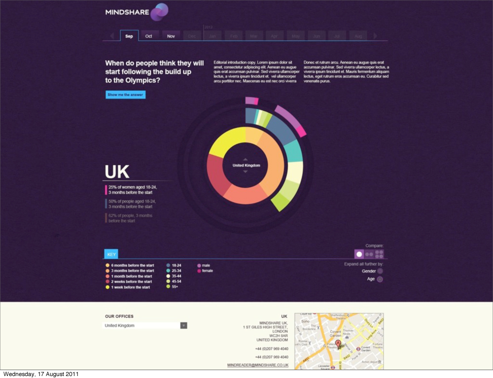
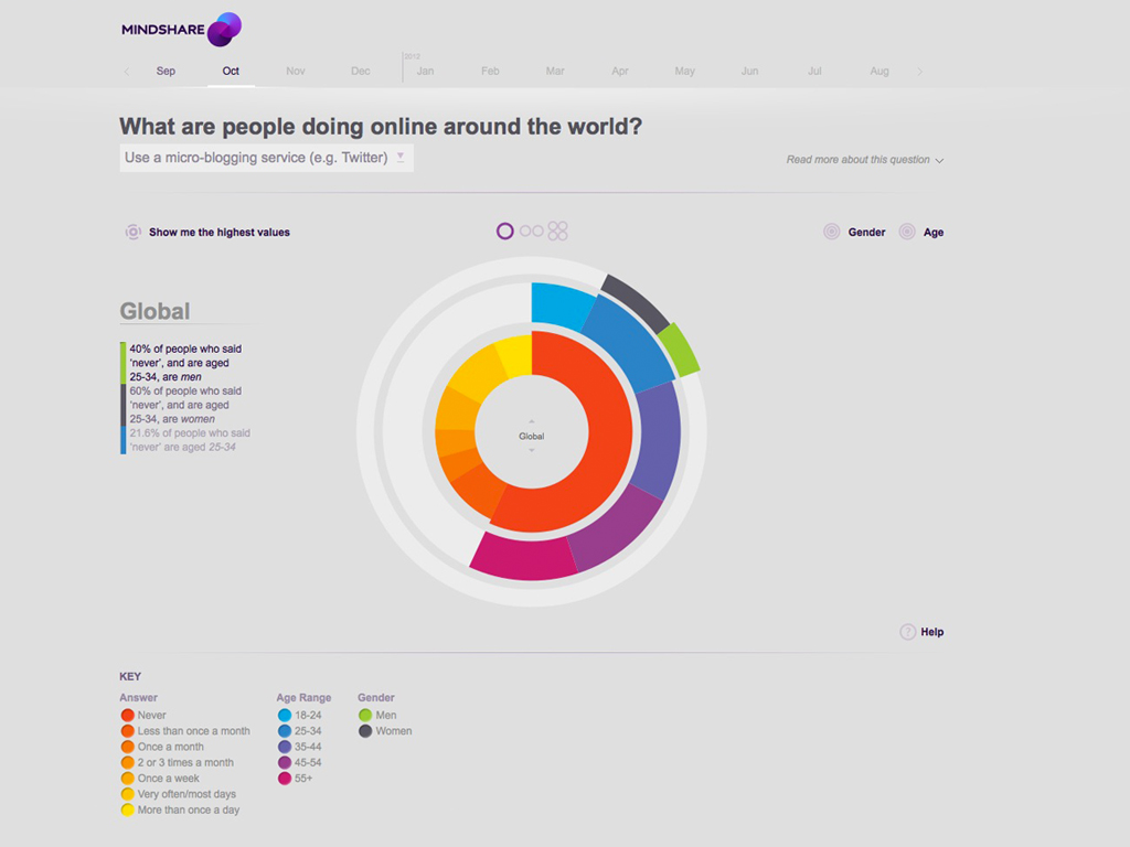
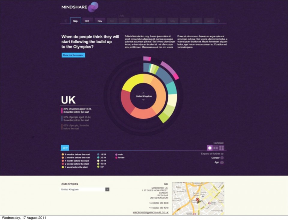
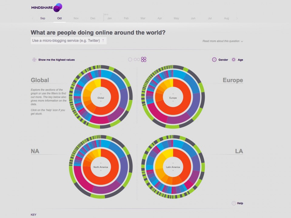
To paraphrase slightly – “This site is the public facing showcase for Mindshares’ proprietary study. Its aim is to understand peoples media habits, lives, attitudes and cultural differences. It covers 36 markets across 5 continents. Using an online panel they survey 1000 people in each country. They cover media habits including both traditional and digital media, concerns, attitudes, lifestyles and a sporting event. This year they have covered the London 2012 Olympics.”
So basically our client needed a way to make a huge and varied amount of data easy to understand and fun, and if possible encourage exploration and understanding. This is for an audience who may be interested in this subject as well as possible clients looking for an agency to help get them market insight.
Quite a challenge when dealing with data as you’re actual product, because with lots of data and numbers there can be a high possibility that people won’t engage with it – if it isn’t clear to understand and easy on the eye. Numbers and traditional graphs can be off putting unless you specifically wanted to see them. For the more casual user a simpler approach is needed…
With the fantastic technical talents of Nicolas Pigelet, a fully dynamic interactive animated set of “data rings” were made reality and fueled by real data thanks to the skills of Igor Ushkarev.
My involvement
Creative lead, Art direction, Design, User experience & interactive direction, Information Architecture, Data visualisation & mechanics.
Visit the site
Click here
Research


Initial Concept:
Look And Feel (briefly)


Mindshare_mindreader Design


Other Initial Concepts – 1 of 2:
Other Initial Concepts – 2 of 2: